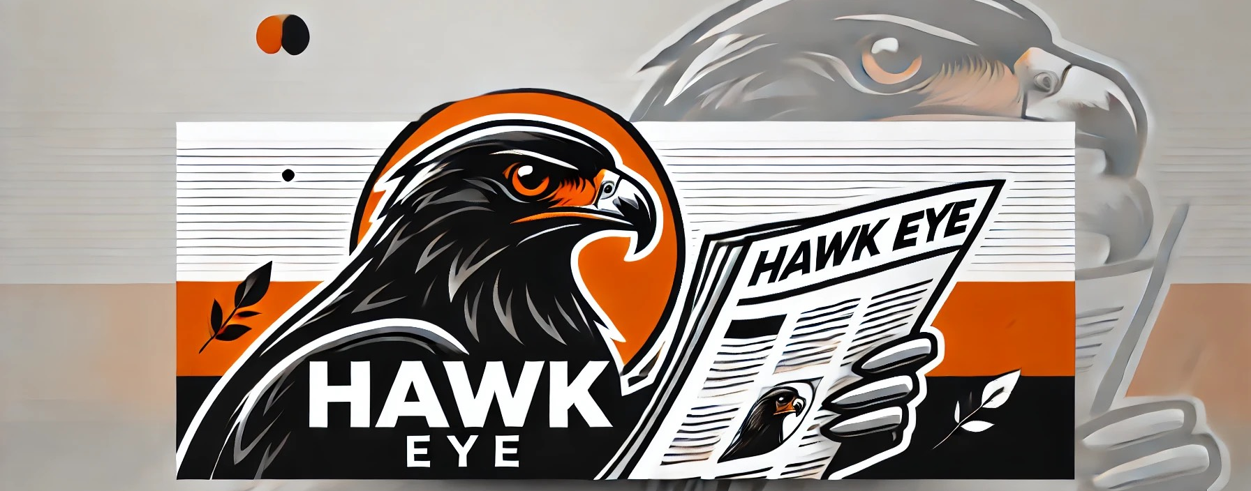
Since conception, the Bethel Park student online newspaper, Hawk Eye, has had a pretty plain logo. This logo simply read “BP.” It was not special, nor did it make this beautiful newspaper ‘pop’. And if it doesn’t ‘pop’, then John Allemang won’t put up with it.
Hawk Eye’s inspirational advisor and creator, Mr. John Allemang, has lived to make Hawk Eye bigger and better. Once he realized how bland the logo was, he knew something must be done. So he went on a quest to make Hawk Eye even better than it already was.
One day in his Period 9 Journalism class, Mr. Allemang told his critical students that he already put down 150 dollars to a website to create us a logo–we all joked and told Mr. A he was crazy for just giving money to a random website. Mr. Allemang took the heat, and his only reply was, “I need you to guys to think of ideas for the logo.”
The creative minds of the Bethel Park journalism class then, for the next few days, continued to put out great ideas for the logo. Each idea had to involve the notable BP mascot, the Black Hawk.
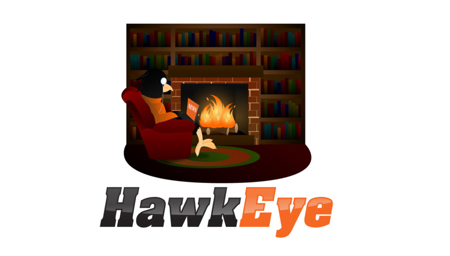
Senior Tom Welman, being a smart-alec, yelled out, “We should just make it a hawk with a top hat and a monocle!” Little did Tom know that this ridiculous idea is exactly what we would end up using.
As the students in the class heard this idea, we collectively thought that it was epic. We continued to shout out even more preposterous ideas to make our hawk even more sophisticated.
“Let’s put him in an expensive leather chair with a laptop on his lap in front of a fireplace in his study!!!” I yelled.
And as you can now tell, that is exactly what we ended up with. In my opinion, our new logo represents our online newspaper very well. It shows our sophistication, as well as our advances in the world of technology. I believe that this logo will continue to show the prominence and skill of Hawk Eye’s writers for years to come.


